Visualizing how geographic and socioeconomic factors influence depression rates across North Carolina to support smarter mental health policy.
Role
Data Visualization Designer
Interaction Designer
Timeline
1 Week
Course
COMP 590 —
Information Visualization
Tools
D3.js · JavaScript
HTML/CSS · GeoJSON
Project Overview
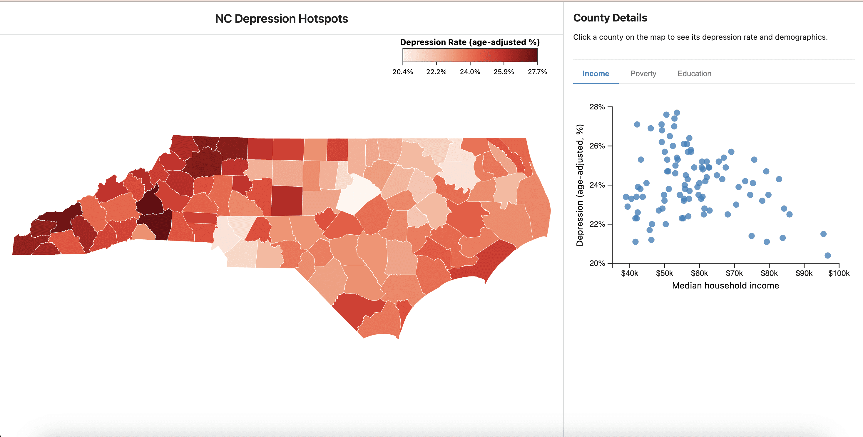
Depression Hotspots Dashboard is an interactive data visualization that explores how geographic and socioeconomic factors influence depression rates across North Carolina counties. Rather than examining depression only at an individual level, this project investigates how structural variables such as income, education, poverty, and regional context correlate with mental health outcomes.
The dashboard was designed to help policymakers and public health stakeholders identify geographic patterns and prioritize areas that may require additional mental health support.
01Problem
Discussions about depression often focus on individual experiences — personal isolation or lifestyle factors. However, this perspective can overlook how broader environmental conditions like income, education, poverty, and geography influence mental health outcomes.
"How might we visualize geographic and demographic patterns in depression rates so that policymakers can better identify communities that may need additional mental health resources?"
Without tools to visualize these contextual factors together, it becomes difficult for public health organizations to identify which communities most need support.
02Research & Data
We gathered county-level datasets for North Carolina and combined them into a single analytical dataset, joining demographic data with geographic data using county FIPS codes — allowing the information to be mapped spatially.
03Design Process
The design process focused on transforming complex demographic data into an interface that allowed users to explore geographic patterns and relationships between variables.
Identified key questions a policymaker would want to answer — where are rates highest, how do socioeconomic factors correlate, and which counties need more resources?
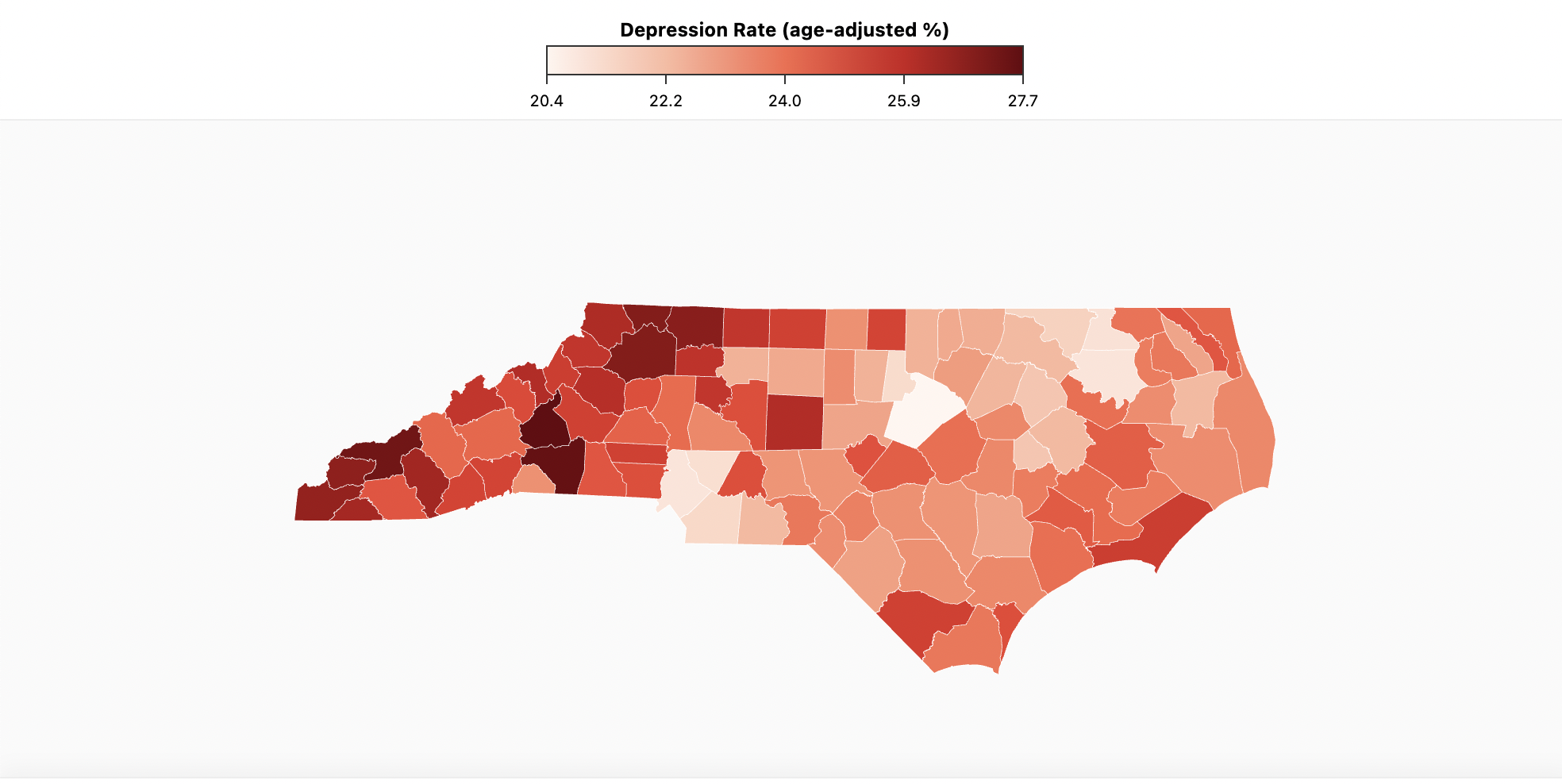
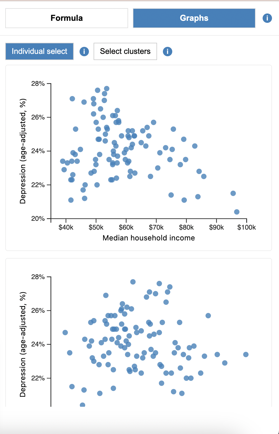
Chose complementary views: a choropleth map for geographic patterns, scatterplots for statistical correlations, and a detail panel for drill-down analysis.
Designed a clear visual hierarchy — the choropleth as the central overview, analytical tools in a side panel, tabbed modes to reduce clutter.
Implemented linked interactions: hover tooltips, click selection that highlights counties across both map and graphs, region filters, and cluster selection.
04Key Features
Sequential luminance color scale highlighting counties with higher rates in darker red. Hover, click, and filter by region (West, Central, East).
Three plots exploring correlations with income, poverty, and education. Linked highlighting connects statistical patterns to geographic context.
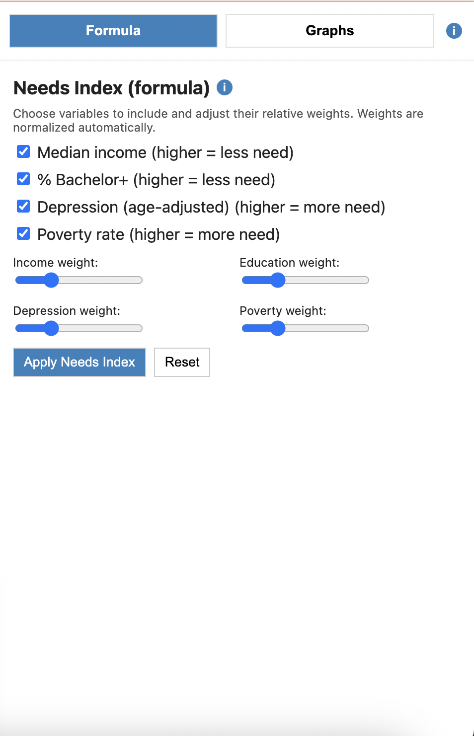
Users adjust sliders to change the weight of each factor — flexible for different policy priorities and research perspectives.
05Key Insights
Depression rates are not evenly distributed. Western and eastern counties show higher concentrations, suggesting strong regional context effects.
A negative correlation between income and depression emerged — counties with higher median income generally showed lower depression rates.
Some Eastern NC counties showed high depression rates despite moderate income, suggesting additional contextual factors are at play.
06Reflection
The dashboard revealed geographic and socioeconomic patterns in depression rates across North Carolina — including a negative relationship between income and depression, and regional outlier clusters pointing to additional contextual factors. By combining spatial visualization with interactive analysis, the project demonstrates how data visualization can support evidence-based decision making for mental health resource allocation.
View Live Dashboard