A full campaign developed for the DC Environmental Film Festival, including concept design, logo identity, and a fashion shoot bible inspired by the documentary "The Bluebird Man."
Role
Art Director
Concept · Identity · Shoot Direction
Context
MEJO 572 Client Project
UNC Chapel Hill
Tools
Illustrator · Photoshop
Adobe Firefly · Canva
Deliverables
4 Campaign Pieces
Concept · Perfume · Logo · Shoot Bible
01 / Overview
This campaign was developed as part of a hands-on visual storytelling class, where we partnered with the DC Environmental Film Festival (DCEFF) to create a real-world campaign for their annual theme: "Against the Current."
The campaign drew direct inspiration from the documentary "The Bluebird Man" — a film about conservationists dedicated to saving the Eastern Bluebird. Every piece of work was anchored in the film's themes: connecting with nature, advocacy through quiet persistence, and the serenity that comes from doing meaningful environmental work.
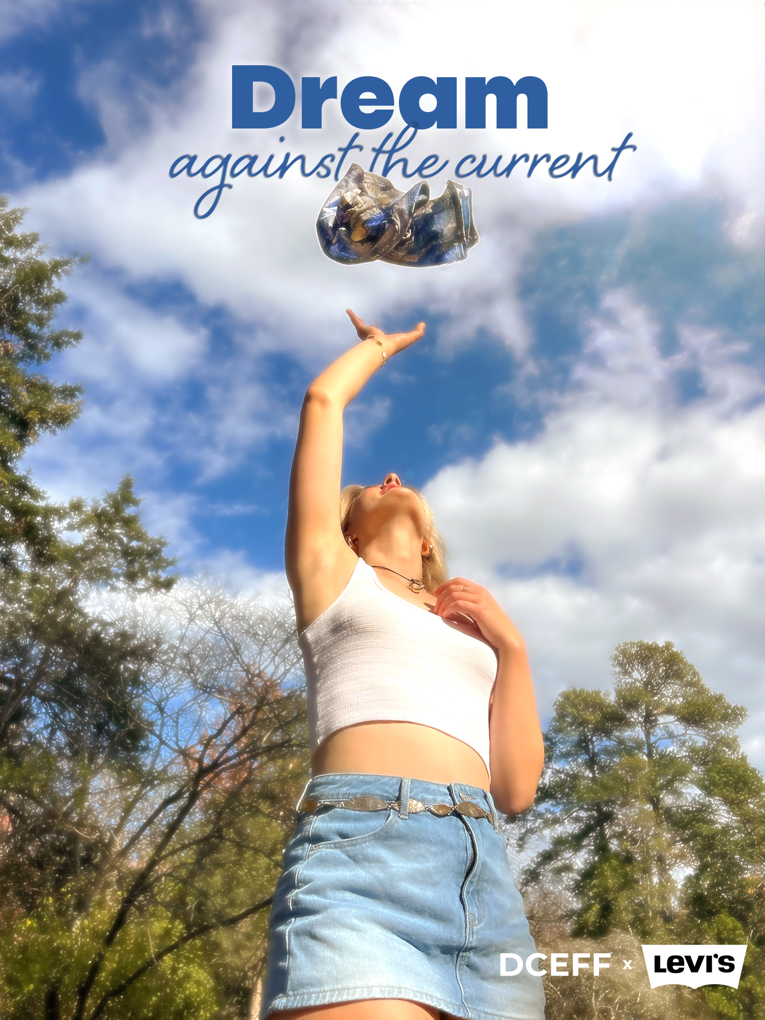
The project produced four deliverables: a concept collage and Levi's print design, a perfume product concept ("Nestled"), a DCEFF theme logo, and a full shoot bible for a Levi's × DCEFF fashion campaign — including the final photos and campaign poster.
"The Bluebird Man" follows a conservationist's lifelong mission to protect Eastern Bluebirds — centering themes of environmental advocacy, patience, and humanity's relationship with nature.
Build a visual campaign identity for DCEFF's "Against the Current" theme — spanning product concept, logo design, Levi's print design, and a fashion shoot bible with final photographs.
02 / Concept Collage & Levi's Print Design
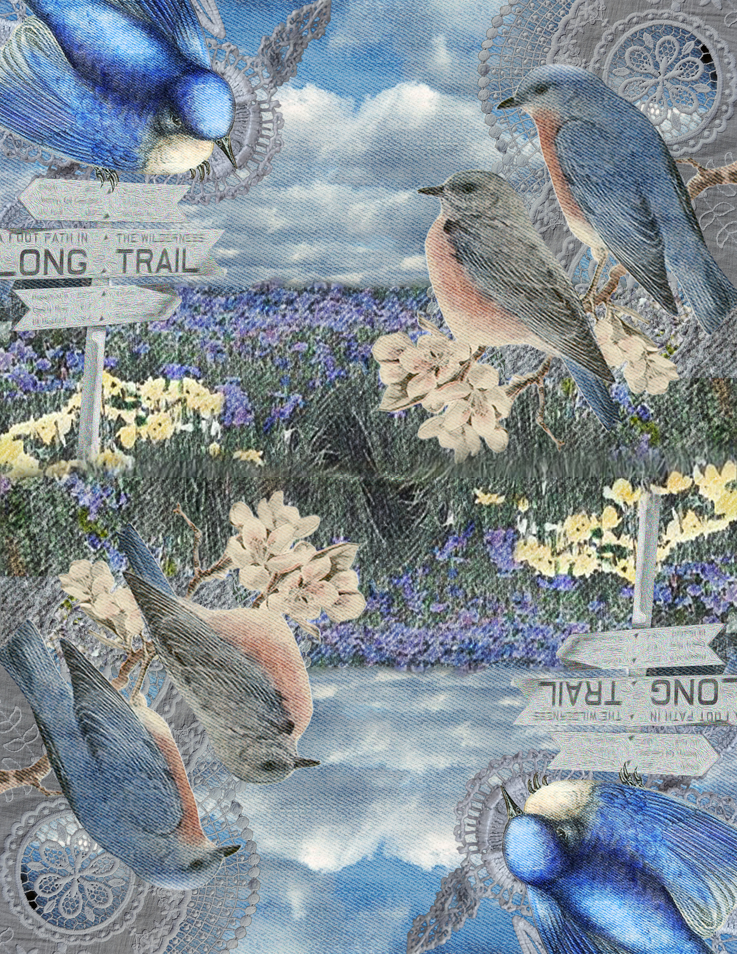
The first assignment was a concept collage capturing the visual essence of "The Bluebird Man." That visual language then became the foundation for a Levi's t-shirt print design.
Levi's T-Shirt Print Design — bluebird concept collage on denim texture
I watched "The Bluebird Man" twice — once for the story, once for the visual language. I noted the recurring palette: soft sky blues, warm rustic browns, the green of meadows, and the orange-rust of the bluebirds' chests. I also noticed the "Long Trail" signage and wooden birdhouse structures that gave the film its rustic throughline.
The mirrored collage composition — sky reflected in water — came from a bathing scene that stuck with me. The concept collage and print both carry that symmetry: nature above, nature below, the bluebird centered in it all.
Sky Blue
The bluebird's wings · open sky · hope
Warm Amber
Trail signs · wood · rustic craft
Meadow Green
Wildflower fields · conservation
Soft Cream
Morning light · morning dew
The full slide deck submitted for the concept assignment — including the collage, the Nestled perfume concept, and the creative process reflection.
03 / Product Design
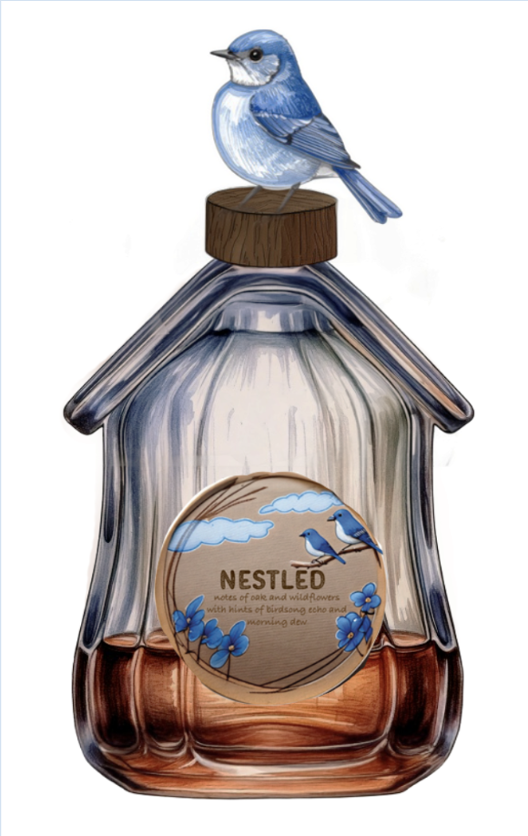
Using the visual language of the concept collage, I designed a perfume product inspired by the film's emotional core: the feeling of being nestled in nature, cared for, at home.
Scent Notes
Oak and wildflowers with notes of
birdsong echo and morning dew
The bottle is shaped like a birdhouse — referencing the film's focus on creating homes for bluebirds. A ceramic bluebird perches on the wooden cap. The amber-to-clear liquid gradient reflects the film's warm, rustic palette. The name "Nestled" evokes the cozy intimacy of being sheltered in nature.
Generated using Adobe Firefly after multiple rounds of prompting. The biggest challenge: Firefly would lock onto its first interpretation of a prompt and resist refinement — requiring completely reworked prompts rather than incremental adjustments.
"I wanted a name that felt cozy and intimate, not dramatic. 'Nestled' captures the feeling of being held by nature — the bluebirds finding safety in the nesting boxes, and the humans finding peace in caring for them."
04 / Logo Design
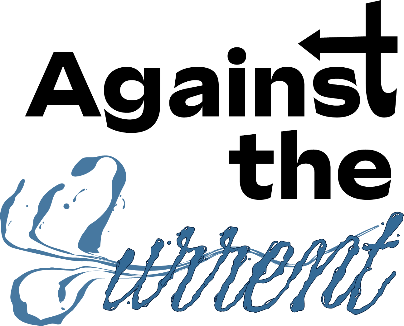
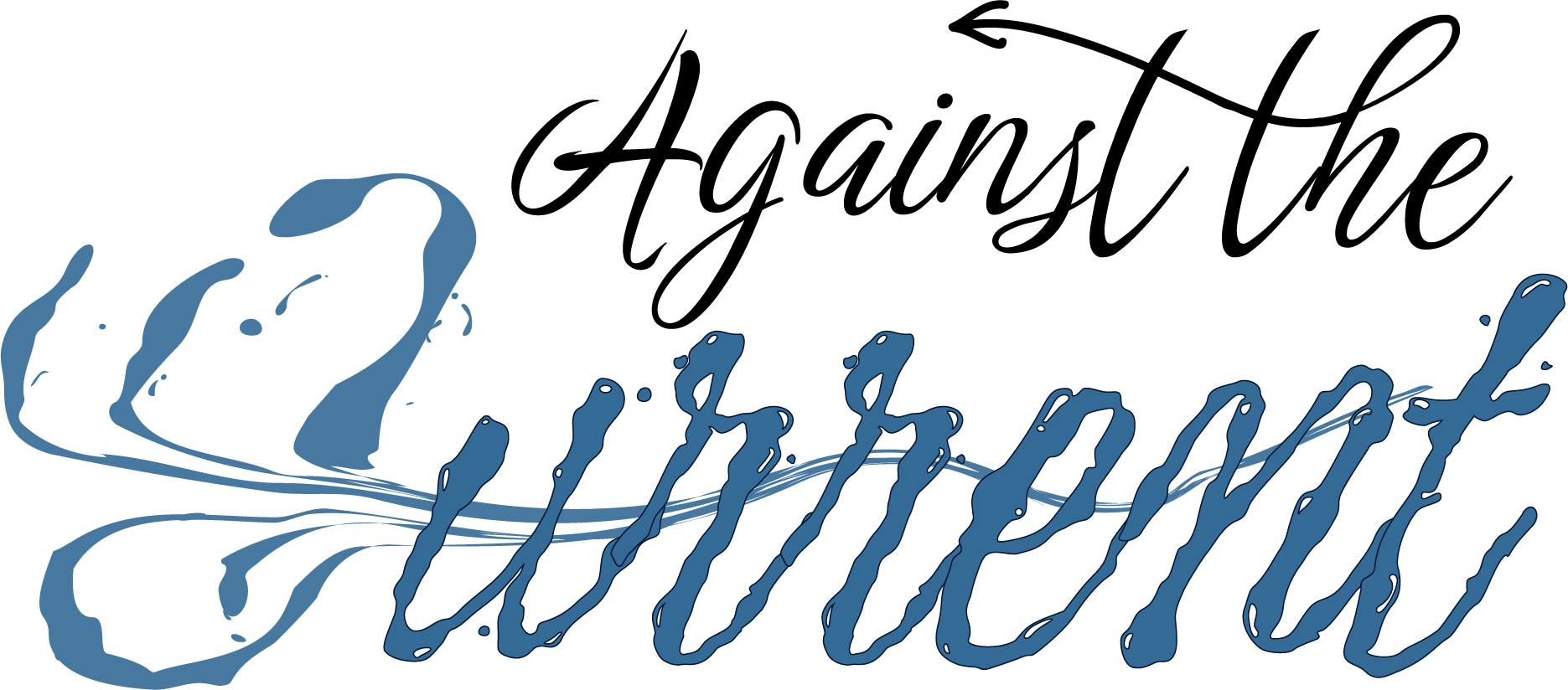
The second major deliverable was a theme logo for DCEFF's "Against the Current" annual season. I designed two iterations — a bold sans-serif version and an all-script final update.
"Against the" in heavy black sans-serif for defiance and clarity. "Current" in liquid blue letterforms — the word itself dissolves, showing the current weakening under change.
"Against the" shifts to flowing script, creating a unified handwritten quality. The tension becomes subtler — both elements share the same fluid nature, with "Current" still dissolving below.
"I didn't want a literal wave or fish icon — that felt too expected. Instead, I made the word 'Current' itself behave like water: pooling, dripping, barely holding its form. The letterforms dissolve and reform, suggesting that the current — the status quo — weakens under the weight of people who push against it."
I went through eight sketch concepts — waves, spirals, mixed scripts, stacked layouts — before landing on the idea of making the word "Current" perform its own meaning. The arrow pointing backwards in the "t" of "Against" quietly reinforces the concept: reversing direction, going against the flow.
DCEFF highlights changemakers — documentary filmmakers, environmental advocates, scientists who push against the current direction of environmental damage. The logo had to feel both defiant and hopeful, just like the films it represents.
The complete logo design deck — including sketches, moodboard, final logo, and updated iteration.
05 / Shoot Bible & Campaign
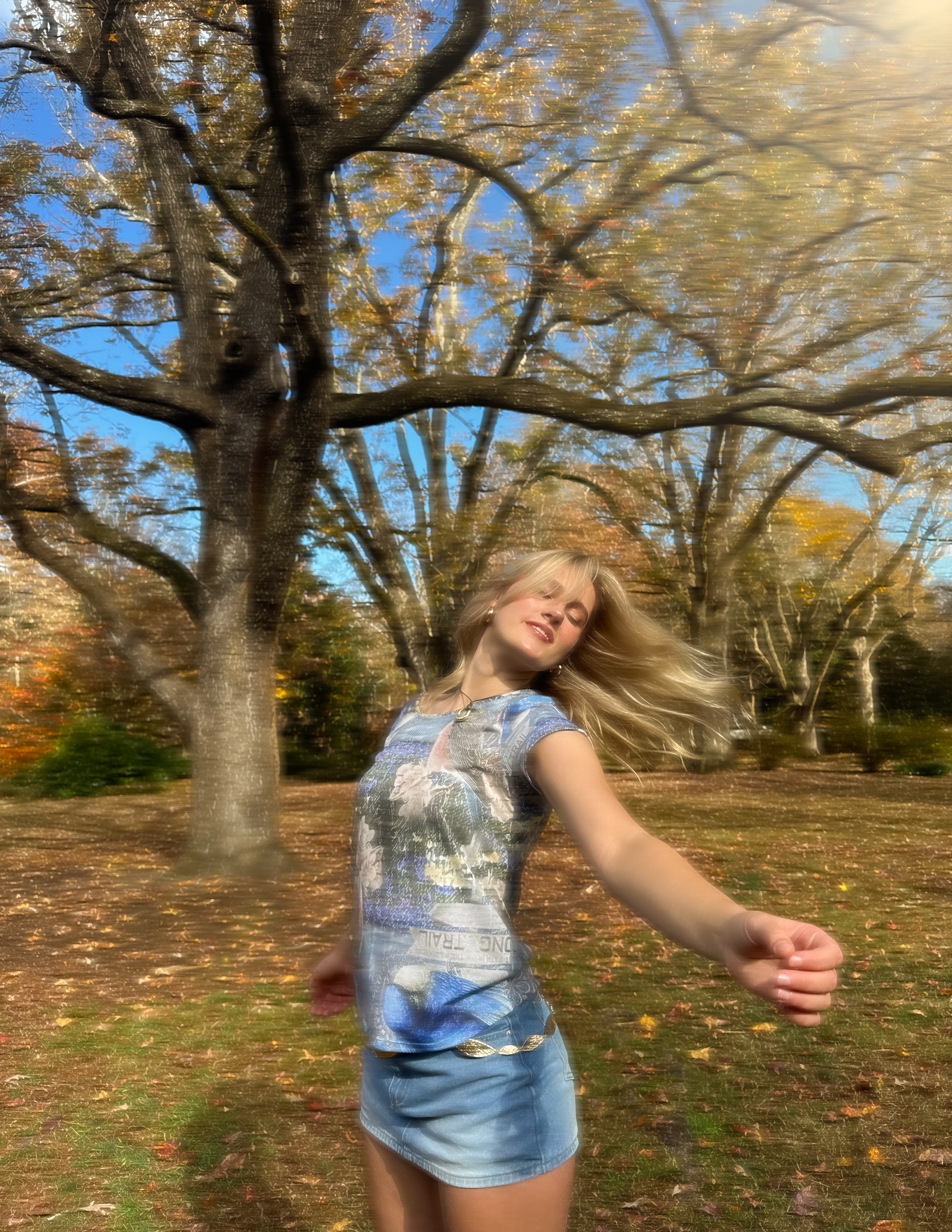
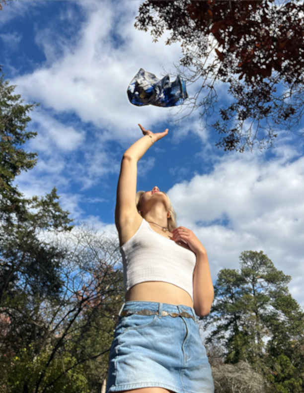
The final deliverable was a comprehensive shoot bible for a DCEFF × Levi's fashion campaign, followed by a real shoot at Coker Arboretum. Below are the three planned shots — and the final photographs.
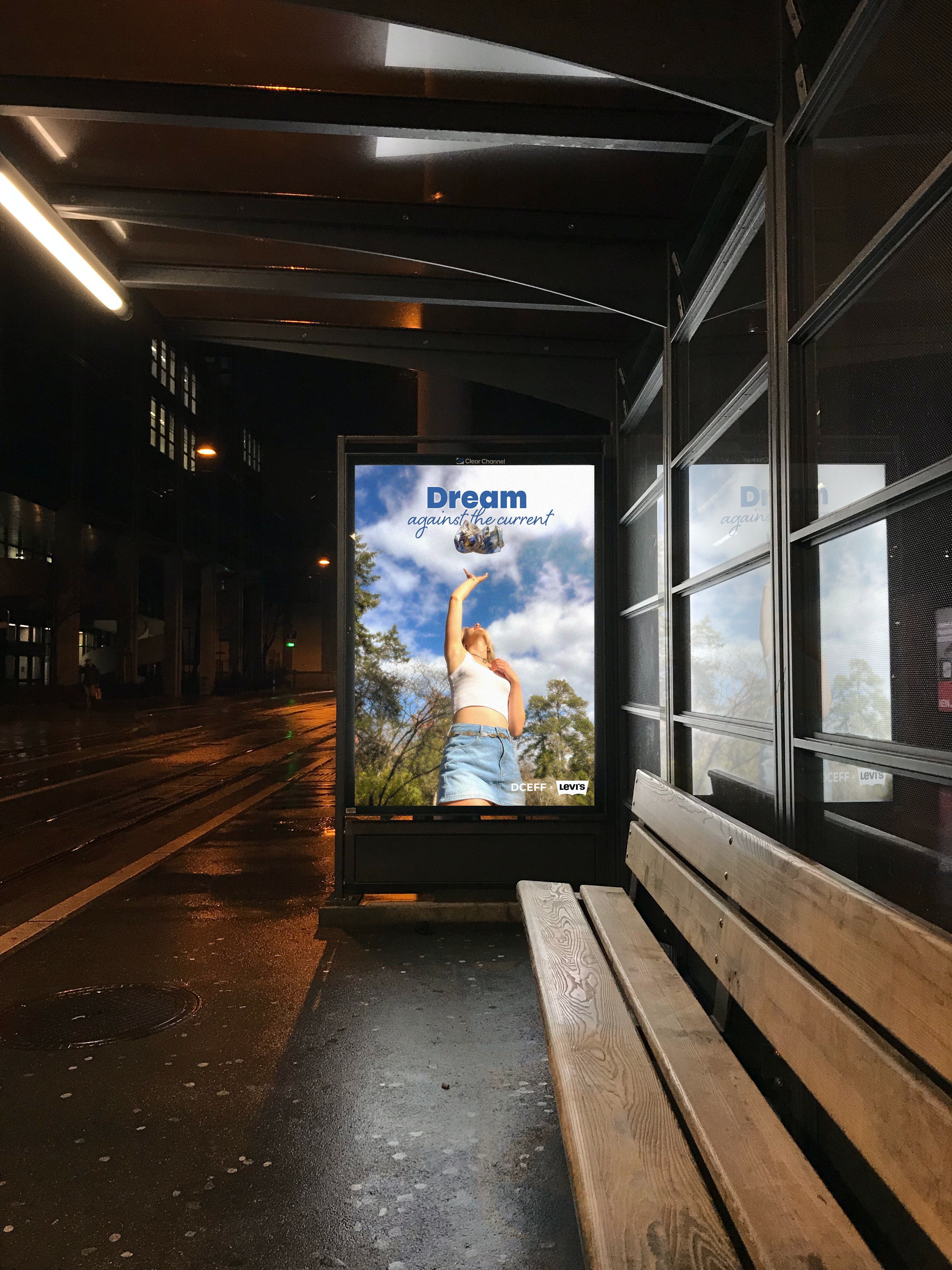
Left: final campaign poster. Right: bus stop placement mockup.
Each shot was pre-planned in the shoot bible with specific framing, lighting, and post-production instructions. Here are the final photographs from the shoot.
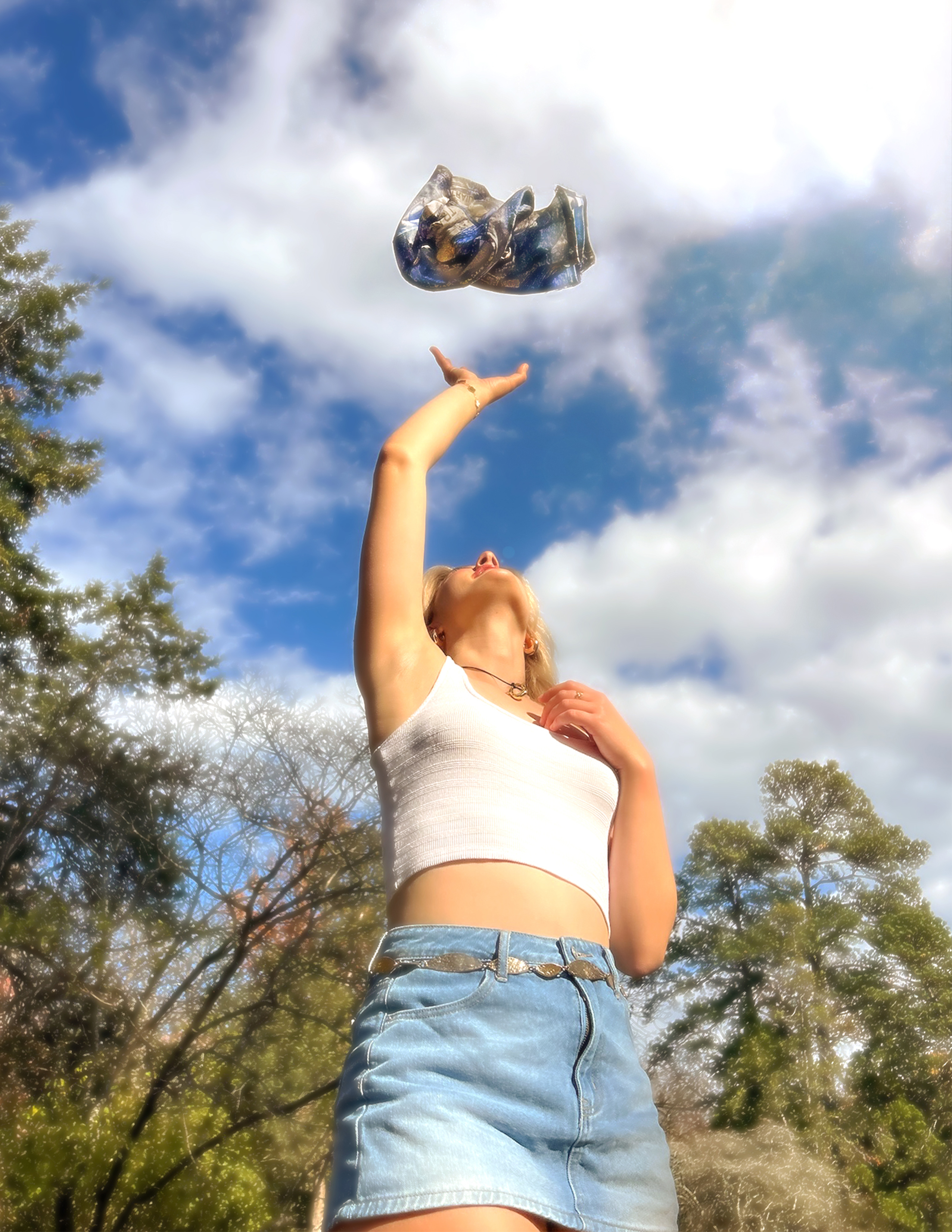
Shot 01 — Low Angle
Model reaches up toward the falling Levi's shirt against an open sky. Backlit, low angle. The shirt was tossed and captured mid-air, then composited.
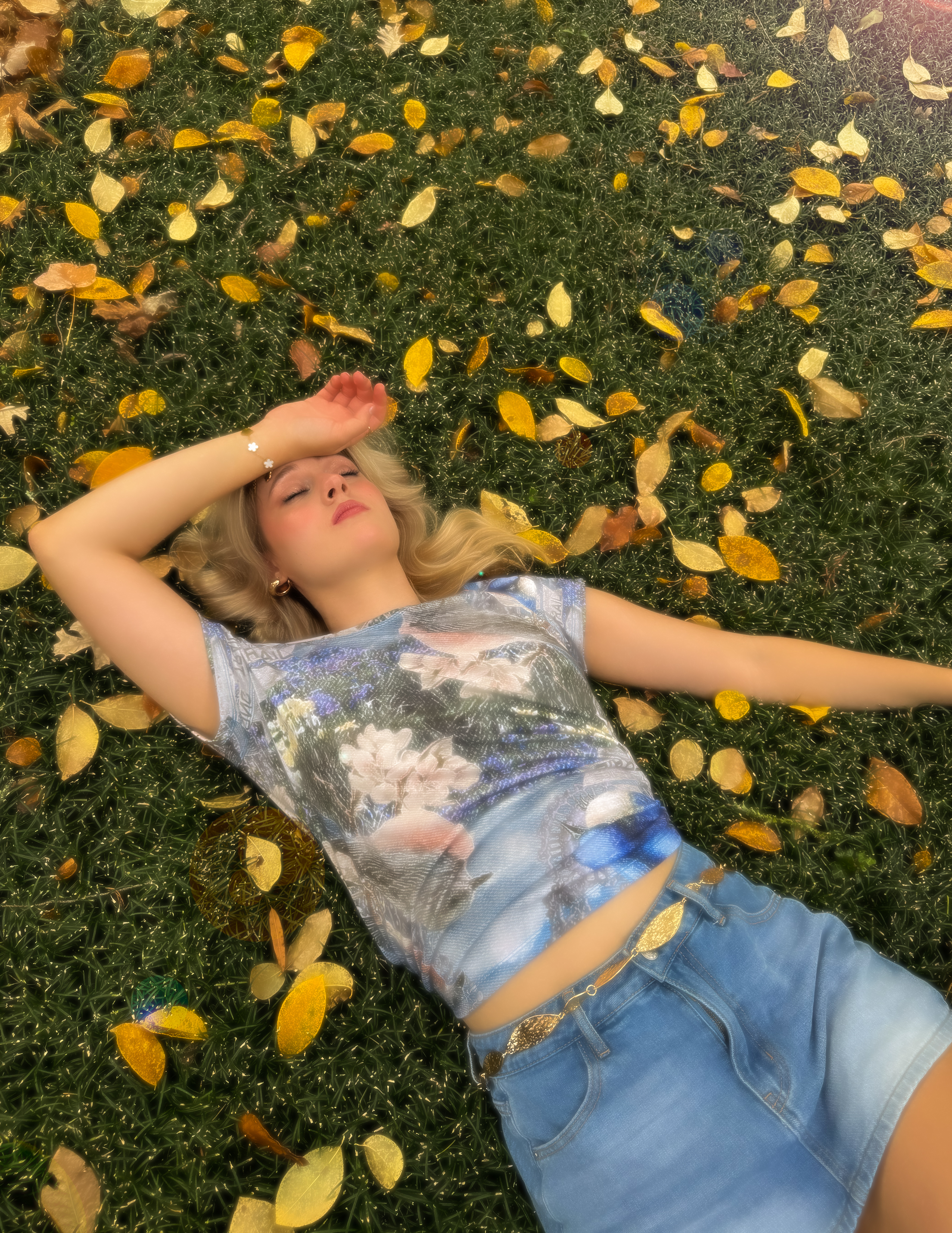
Shot 02 — Overhead
Model lies in the grass and fallen leaves wearing the featured Levi's shirt — the image of daydreaming realized. Overhead perspective, soft autumn light.
Shot 03 — Motion
Blurred motion shot of the model spinning freely at Coker Arboretum. Warm golden light, hair and jacket caught mid-movement. Shot in burst mode for the motion blur effect.
Raw still — before typography and DCEFF × Levi's branding were added in post.
The shirt was composited higher into the frame using Photoshop — per the shoot bible's instruction to leave sufficient space between the model's hand and the object in-frame.
"Dream" in bold blue type and "against the current" in the matching script used in the logo — keeping the campaign visually unified across all deliverables.
The full shoot bible — including the campaign concept, moodboard, shot list with post-production notes, video storyboard, styling, hair & makeup, and location details.
06 / Creative Process
I watched "The Bluebird Man" twice — once for the story, once for the visual language. I paused on color palettes, noted recurring textures (wood, sky, wildflowers), and tracked the emotional register of each scene. This became my creative brief to myself.
The in-class sketching sessions were transformative. I typically get paralyzed trying to make something perfect before it exists. Sketching freely let me generate 8–10 concept directions in a sitting. The birdhouse bottle and the liquid typography both emerged from this low-pressure space.
Each deliverable went through at least one formal revision. Concept collage: fixed the symmetry axis. Nestled: adjusted label typography spacing. Logo: evolved "Against the" from bold sans-serif to script in the final version. The first version is always just the starting point.
Adobe Firefly was part of the workflow for the perfume bottle imagery. The key learning: Firefly locks onto its initial interpretation and resists incremental adjustments. Instead of adding descriptors, I found it more effective to scrap and restart with an entirely reframed prompt. Working with how the tool thinks became a skill in itself.
The shoot bible had to communicate my vision clearly to a photographer, model, and stylist who each had their own expertise. Writing post-production notes — spacing requirements, burst shot instructions, background clearing — taught me that great art direction anticipates editing before you even pick up a camera.
07 / Reflection
I expected ideation to be the hard part. Execution — specifically getting AI tools to actualize my vision — was where I spent the most energy and learned the most.
Start Firefly prompting much earlier. Generative AI rewards iteration volume — I'd give myself more time to experiment with prompt strategies before committing to a direction.
This project confirmed I want to work at the intersection of storytelling and visual strategy — using design to communicate ideas that matter, not just to make things look good.
Four deliverables. One through-line: the feeling of standing in nature and believing that small acts of care — for bluebirds, for community, for the environment — add up to something bigger than ourselves. That's what "Against the Current" means to me.